Vacation Rentals In Barbados
Vacation Rentals in Barbados (VRIB) is a locally trusted platform connecting travelers with handpicked villas and vacation properties across the island. While the brand has established itself through personal service and curated listings, the current digital experience does not fully support that value—especially when it comes to efficiency, trust, and conversion readiness.

Vacation Rentals in Barbados (VRIB) is a property listing platform losing potential revenue due to friction in its booking flow.
This audit focuses on key user paths: homepage, property discovery, listing pages, inquiry forms, and mobile usability—through the lens of booking intent and conversion clarity.

01. Overview & Audit Objectives
Unlike major platforms in the short-term rental space, VRIB does not currently operate with a dedicated in-house booking system. Instead, inquiries submitted through the site require manual coordination: once a user expresses interest, VRIB must reach out to the property owner to confirm availability before responding to the guest. This lack of real-time feedback introduces delays, increases user drop-off risk, and limits scalability.
Real-time availability & booking integration
Intuitive property filtering and sorting
Search via map view or location proximity
Event capturing & tracking user data
Data tracking inexistent
Compounding these gaps is the total absence of behavioral data tracking. Without tools like Google Analytics, Hotjar, or event-based tracking, there is no visibility into how users interact with the site, where they drop off, or which listings generate the most interest.

Given these challenges, the goal of this UX audit is to:
Uncover friction
Fill the gaps
Structure & content
Quick-wins
Data-driven approach
In-house booking
02. Conversion Potential Assessment
The current version of the VRIB website significantly limits its ability to convert visitors into confirmed bookings—not due to a lack of demand, but due to foundational UX and structural gaps that create friction, uncertainty, and delays.
The most critical barrier is the absence of an integrated booking system. Users are required to submit a general inquiry, after which VRIB manually contacts the property owner to confirm availability before responding. This offline bridge adds hours—or days—to a process that most users now expect to complete instantly. The lack of real-time availability and booking confirmation introduces uncertainty and significantly increases the risk of drop-off after interest is expressed.
In addition, conversion best practices are missing across key parts of the user journey:
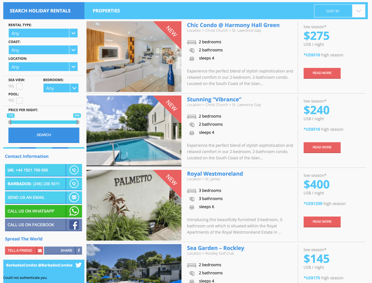
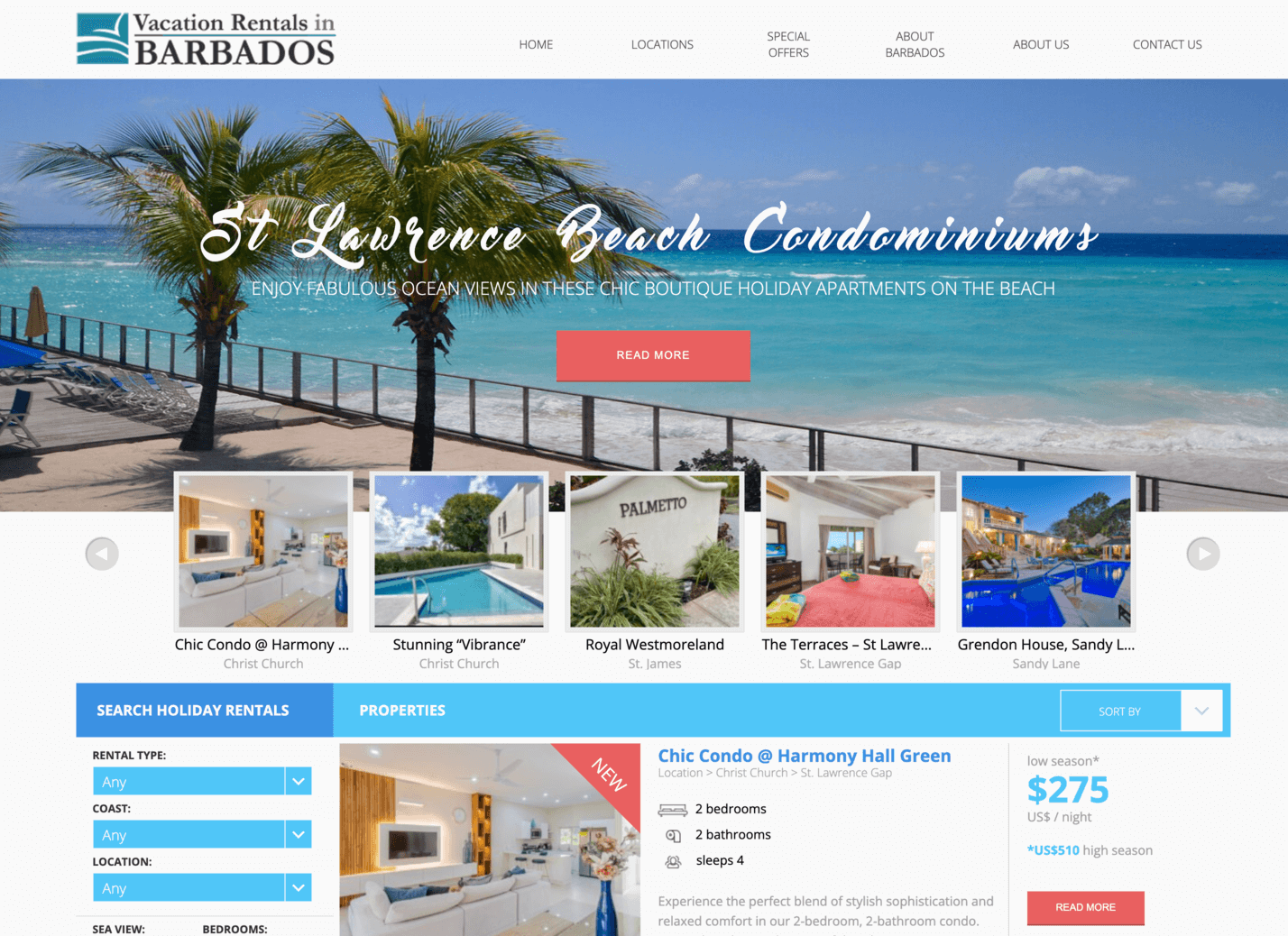


In short, the current setup does not meet modern expectations for digital booking. While the quality of the listings may be strong, the site lacks the structure, urgency, and trust cues required to convert browsing into bookings—especially among users accustomed to seamless platforms like Airbnb, Plum Guide, or The Thinking Traveller.
03. Booking Journey Walkthrough
From a new visitor’s perspective, the booking journey on the VRIB website presents several critical obstacles that interrupt flow, delay decision-making, and introduce uncertainty.
Homepage
Listings
Property
Inquiry
Key Points of Friction
This booking experience feels more like filling out a contact form than making a travel decision. In a competitive market where speed, clarity, and control are key to conversions, the current process poses a serious barrier to growth.
Lack of upfront filtering and search tools
No indication of real-time availability
Unclear expectations post-inquiry
No pricing transparency or urgency
04. PageSpeed & Performance Audit
The performance of a website directly impacts user experience, perceived trust, and—most critically—conversion rates. In the case of VRIB, speed scores reveal substantial room for improvement, especially on mobile devices, where the majority of modern travel browsing takes place.
Mobile Performance: 46/100 (Poor)
These numbers indicate a highly delayed initial experience for mobile users. Slow paint times can discourage scrolling and increase bounce likelihood—especially among new visitors expecting quick access to listings.
Desktop Performance: 67/100 (Needs Improvement)
While faster than mobile, layout shifts and render delays still undermine perceived quality. Pages load unevenly, pushing visible content during interaction—an issue that negatively impacts trust and usability.
Key Issues Identified
Users—especially on mobile—are forced to wait over 9 seconds to see content. That delay creates doubt and impatience, and paired with the lack of interactive feedback or clear loading progress, often results in abandonment. For a business reliant on inquiry-based conversions, this speed lag represents a silent but powerful leak in the funnel.
Large layout shifts
Slow LCP on both mobile and desktop
Heavy unused JavaScript (567 KB)
Outdated image formats
No image compression / improper sizing
Render-blocking resources
You’re likely missing out on over ~$280K/year
Due to outdated design and an unoptimized user experience, Will Cotrino’s website could be losing up to $24,000/month in potential consulting revenue.

From Guesswork to Growth — Track What Matters
We know that great design drives business results. That’s why we don’t just redesign — we measure. By tracking key metrics before and after our UI/UX improvements, we’ll show exactly how your website converts better, retains more users, and increases revenue. Before we start, we’ll define your baseline metrics to make every improvement tangible and data-backed
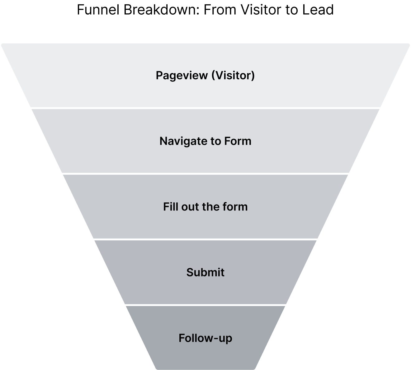
Forkeen will help you by…
Making it interesting
Making it healthy
Makes it sellable

Ready to solve these challenges and accelerate your growth?
u003cp class=u0022p1u0022u003eChoose a time below to start your project kickoff — we’ll review your current challenges and uncover design strategies to help you scale faster and smarter.u003c/pu003e
